It’s been a busy couple of years for Hivebrite.
We’ve experienced rapid, exponential growth. We’ve strengthened our product with new features to boot. And our business model has evolved.
To cut a long story short (or “Bref” as the French would say), we realized it was high time for a makeover.
We decided to refresh our look to better reflect the company we are today.
We are no longer the startup of the early days.
We have evolved into an industry-leading community engagement platform. We are engaging with enterprise customers and wanted a more modern and sophisticated look to reflect our growth and maturity.
A word from Jean, our Founder and CEO
“When we started Hiverite almost a decade ago, we never imagined the incredible transformation we would undergo as a company.
We weren’t originally called Hivebrite. In fact, we made a crucial pivot before becoming the platform we are today.
We started as “KeepInTouch”. A B2C platform that provided a private and branded online space for university graduates to connect and exchange. But, we quickly realized that an effective online community can offer extraordinary value to almost every type of organization.
We went back to the drawing board and relaunched as Hivebrite—a comprehensive community management and engagement platform built to provide all types of organizations with the tools they need to create the most vibrant and impactful communities possible.
Fast forward to 2023, and over 1000 organizations, including Boeing, Roche, the Obama Foundation, the National Academy of Sciences, the Aspen Institute, the University of Notre Dame, the U.S. Naval Academy, and U.C. Davis trust our platform to power their communities.
Unsurprisingly, this hypergrowth made us realize that our brand identity also needed to evolve. We spent months considering how to revamp our look while underscoring our credibility and instilling trust.
Today, we are incredibly proud to reveal our new look that reinforces Hivebrite as an enterprise brand and leader in community-building technology.
Jean Hamon, Founder and CEO, Hivebrite
Our new look in a nutshell
Helping our customers drive impact is at the heart of our business—and we wanted our logo to reflect this. We’ve redesigned it to be more impactful with our new eye-catching blue and bold typography.

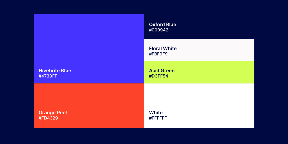
We have chosen vibrant new accent colors that increase readability and legibility while making our design instantly more recognizable.

Our latest typography is bold and confident (like us!). We have two fonts for better hierarchy. One for headlines and subtitles. And one for copy text that is easier to read at a smaller size.
Head over to hivebrite.io to see our new look come to life.
You’ll notice that our new pages are peppered with photos of people because that’s what community is all about at its core.
In addition to its visual makeover, the website has been structured around our five pillars: Brand, Organize, Engage, Empower, and Monetize. These are the key functionalities that drive our product, and through them, we showcase the powerful features that make Hivebrite an industry-leading community platform. The new site is also home to our community-building resource center that shares webinar recordings, podcasts, guides, and more!

So there you have it. Our new look. We’re still Hivebrite. And we’re still as obsessively passionate as ever about helping organizations build great communities. The only difference is we now have a top-class brand identity to match the company we are today.
Hivebrite is an all-in-one community management platform. We empower organizations of all sizes and sectors to launch, manage and grow fully branded private communities. Schedule a demo today!


%20(1).png?width=1650&name=hivebrite-logo%20(2)%20(1).png)